Northwest
Healthcare Properties
Brand Video
The client
Taking the status quo and making it status whoa is definitely our jam. That's why we didn't hesitate when 50,000feet and Northwest Healthcare Properties approached us to help them reimagine the stuffy (read: boring) corporate videos commonly seen in the healthcare real estate industry.
the ask
From storyboards to animation, stock video selects, talent search and VO recording, music research and sound mixing, we had to make the vision of Northwest Healthcare Properties and 50,000feet come together in a unified way. The goal? An engaging brand video that was super contemporary, emotionally captivating, and effortlessly educational.
The answer
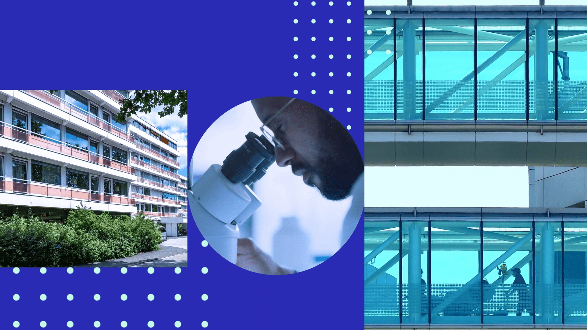
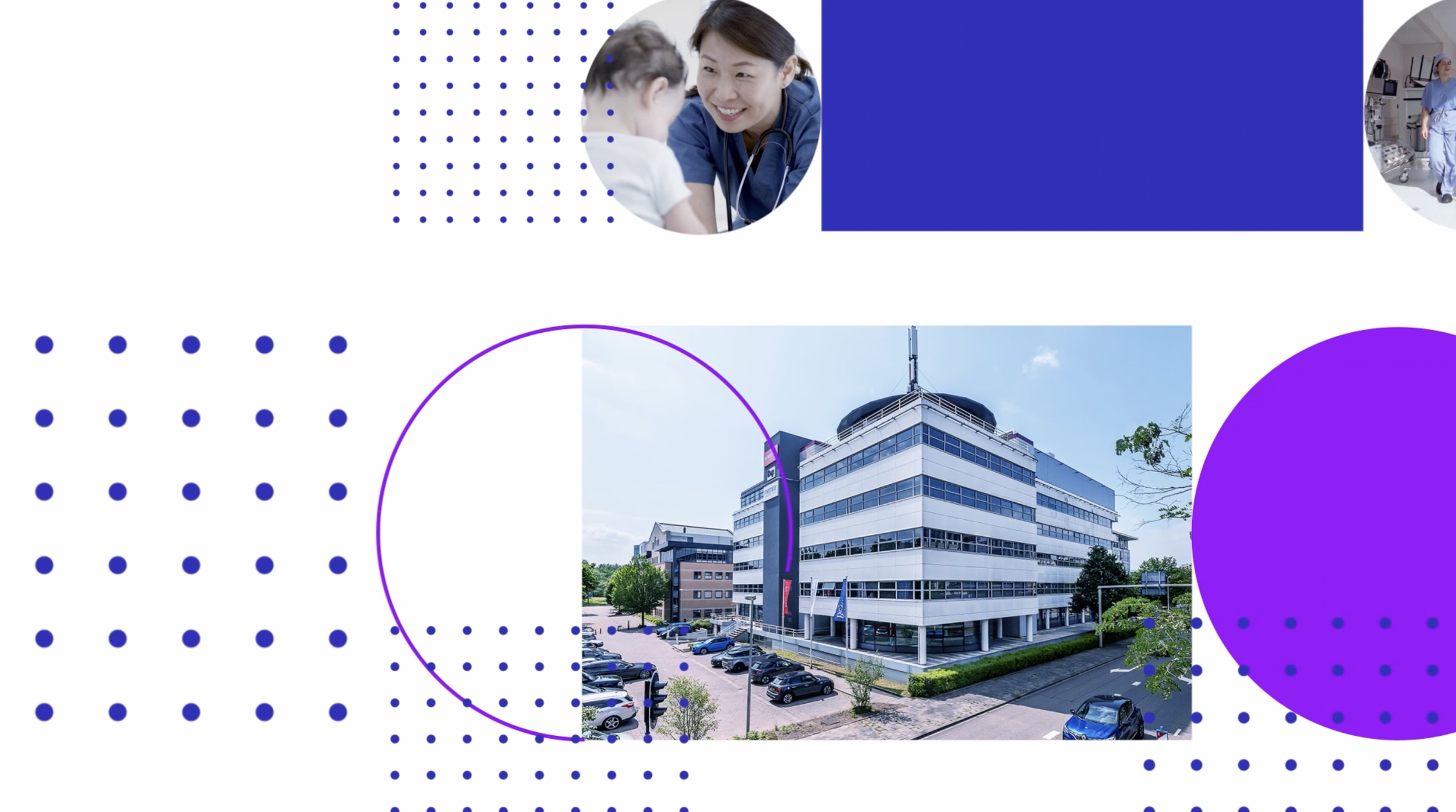
Using the fantastic rebrand dreamt up by 50,000feet, we deconstructed the logo and used the hero shapes as a device to move the story forward. Circles and squares transport you effortlessly from one scene to the next, while highlighting central themes, and supporting key visuals.
Bringing the brand to life through motion design
Simple elements can lead to robust inspiration and intricate design. We deconstructed Northwest’s logo, playing with scale, size, and colour, then multiplying and layering the shapes with stock images. The result was complex but harmonious, keeping viewers captivated.
Continuous Flow
The animation takes you on a journey with no break in the action. The scenes evolve continuously with the logo’s hero shapes as your guiding light through the journey. As we move from scene to scene and human to human, the messages reach the viewers on an emotional and educational level.
Captivating layers
A twist on a classic slide show, we animated the hero shapes in harmony with the stock footage, adding layered effects and a cohesive tint, and of course moving every element to the music. Think of us like magicians adding key ingredients to a cauldron—and poof you’ve got motion magic A.K.A. a corporate video like no-other.
Simple to sensational
The goal was to express the brand’s core values through movement. Northwest’s logo is clean and minimal (the square = place and the circle = possibility). We used these basic shapes in elaborate ways to elevate key messages and stats and create connection to the viewer through art and animation.

Director of Client Services
50,000feet
The video was received incredibly well by the company, we’ve heard nothing but great things come back from our client about it. Thank you so much for all of the work and collaboration on the project.

YOU MAY ALSO LIKE